


Problem
Educating event organizers and institutions on creating and assigning digital credentials to employees, volunteers and participants for skill verification.
Research
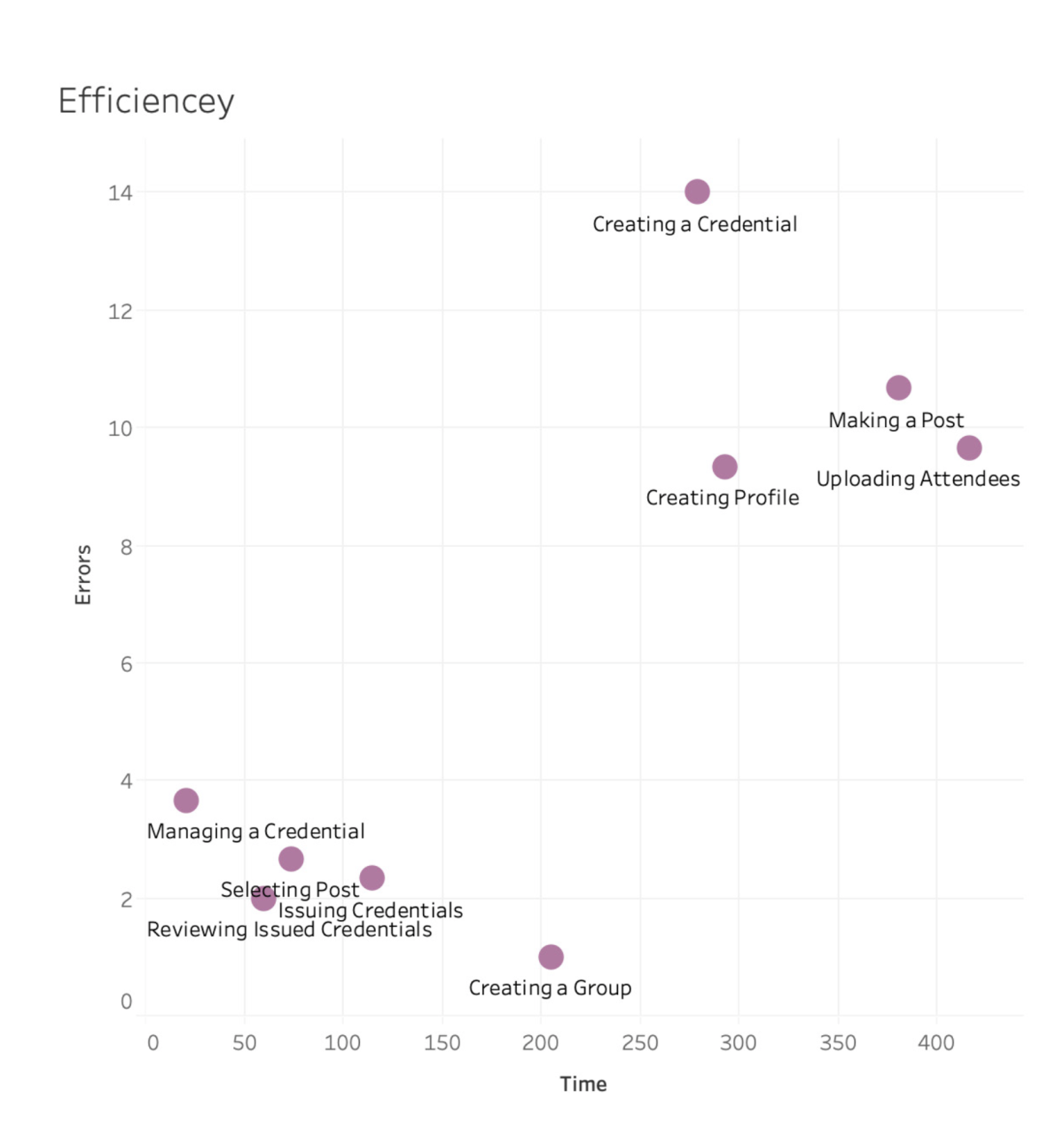
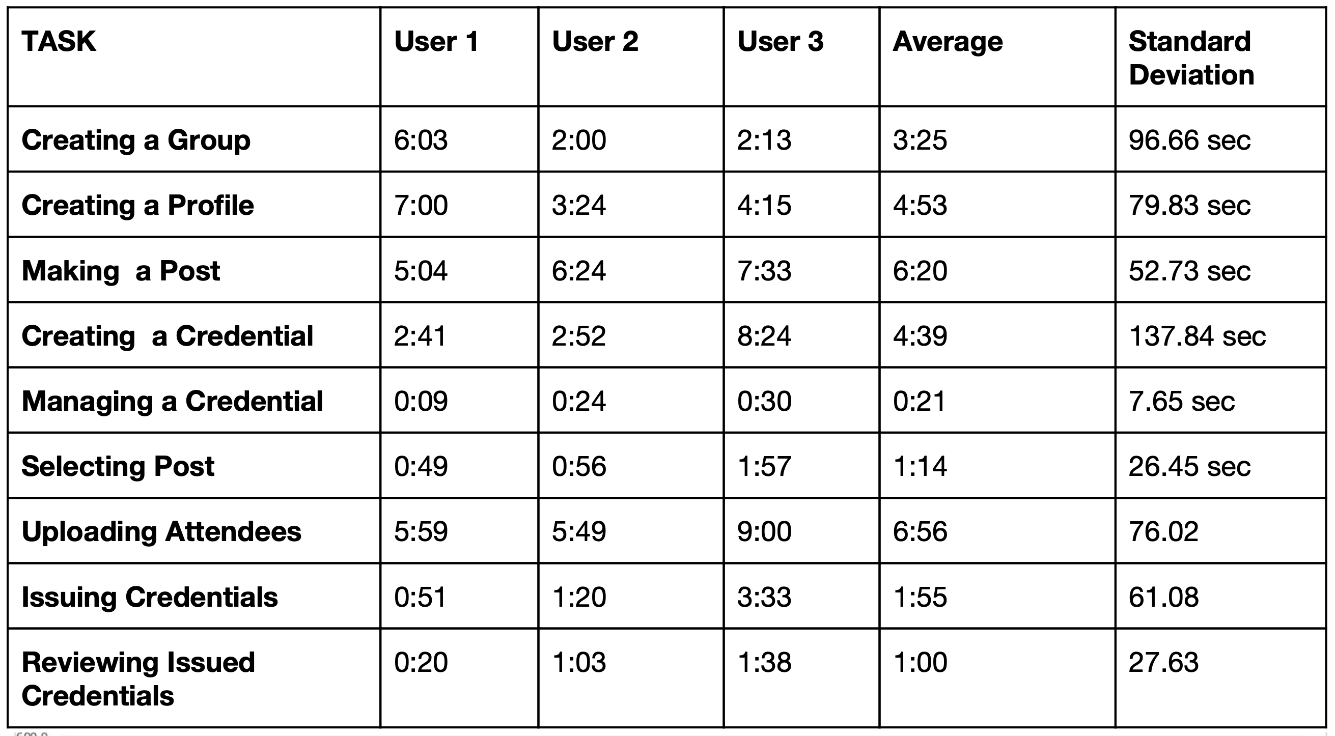
The client provided usability testing reports from various organizations, which served as preliminary research for our project. These reports highlighted multiple aspects of the site’s functionality. A key insight gathered was that credential creation, though the most important task, was also the most challenging and frequently failed task for participants. Due to system constraints, we couldn’t significantly alter the process. Therefore, our focus shifted to effectively educating new site visitors through a walkthrough tutorial and encouraging them to share it on social media.

Finding a Solution
With our direction identified and similar solutions evaluated, the team began analyzing the concept sketches provided by the client. Each member performed heuristic evaluations, following Neilson’s 10 principles, to identify strengths, weaknesses, and areas for improvement. Using dot-mapping, the group prioritized key focus areas: visibility of status, error prevention, and recognition rather than recall. This foundation allowed the team to sketch wireframes and ideate their initial prototype for Skill Squirrel.
Wireframing


Design Inspiration: Our design for Skill Squirrel’s walkthrough tutorial was inspired by several existing platforms. From LinkedIn, we adopted the use of clear headers and fluid navigation to help users understand each step and easily go back for clarification. SkillShare’s approach to letting site visitors watch first lesson without the need to sign up influenced our design decisions. Lastly, Optimal Workshop’s interactive yet straightforward tutorials inspired us to create a simulation which would not overwhelm the users.
Initial Protoype


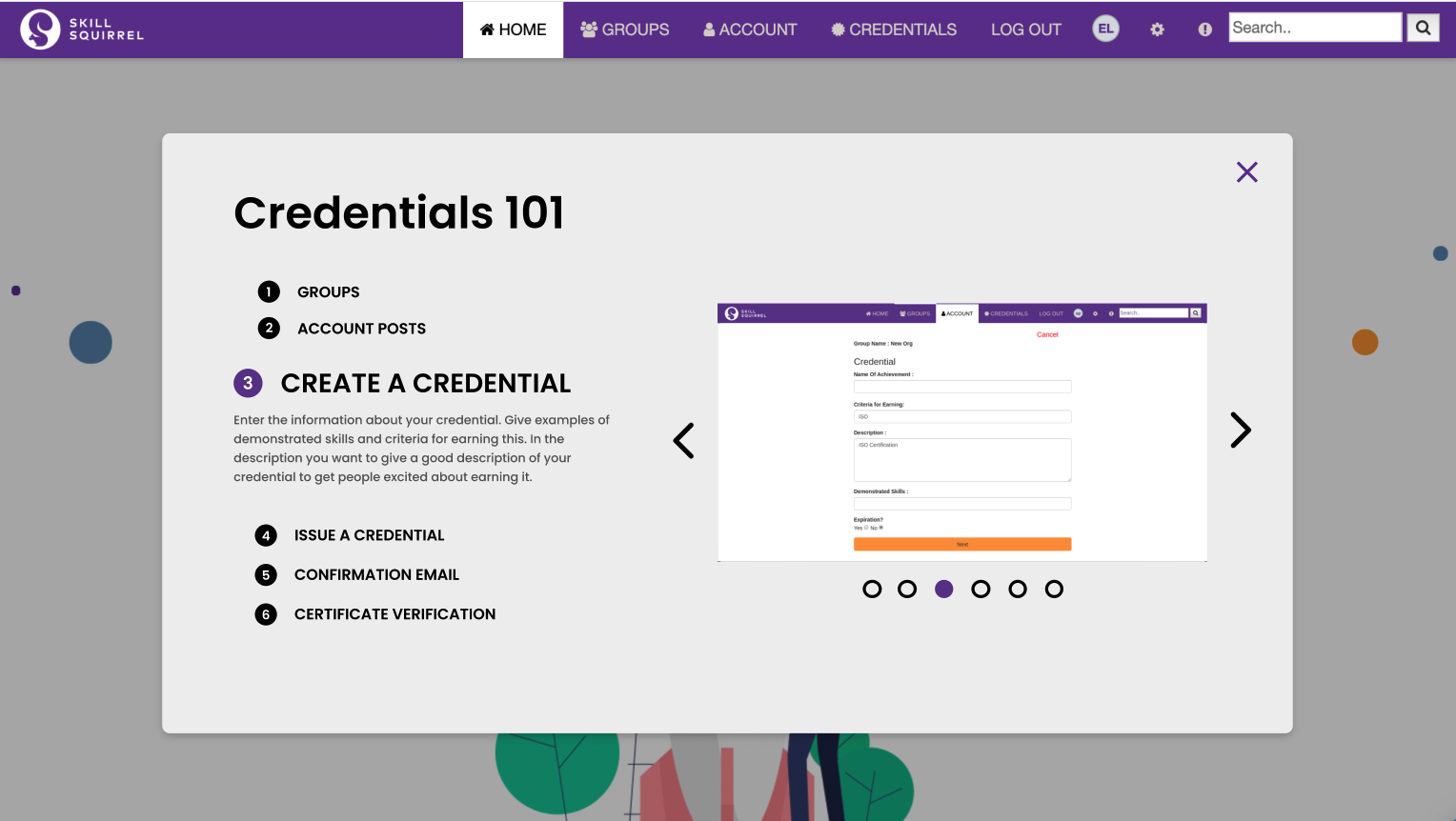


Effective Teaching Tool: This format was chosen to effectively teach potential Skill Squirrel users how to issue credentials, leveraging the client’s provided screenshots.
User-Friendly Design: The design aimed for simplicity and straightforwardness, ensuring an intuitive user experience for the credential creation process. Needless to say, our design adhered to Skill Squirrel’s existing brand by using their fonts, colors, and images.

Interactive
Switched from a static tutorial to an interactive simulation.
Consistency
Aligned design with the client’s credential-issuing system.
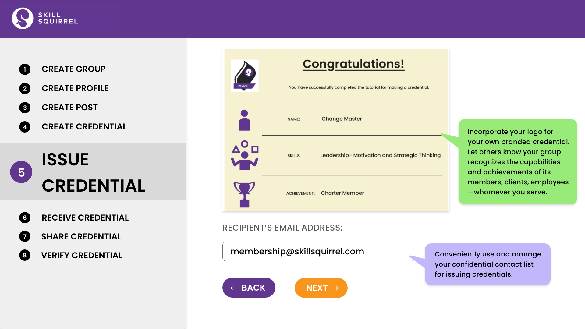
Context
Added colored speech bubbles to every field for context.
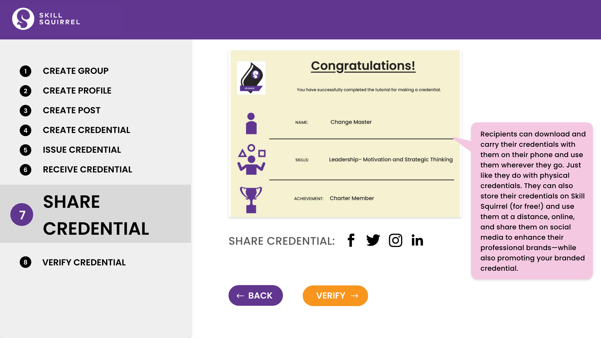
Sharability
Improved sharability of credential images on social media platforms.
Seperation
Remove the elements of the live site such as profile icon since it will not be installed to the live site


Course of Action
Next Steps
The walkthrough should be in line with the common design trend, dark mode. This was expressed by a few interviewees and participants in the post test questionnaire. They believed it would reduce strain on the eye and look ‘cooler’.
Some more research should be conducted to devise a way to effectively communicate the value proposition of Skill Squirrel’s initiative and how adopting it can improve the market practices surrounding job hunt and building skill credibility.


